
04. Painting and patinating the walls
- Mar 28, 2024
- 5 min read
Restoration, Reconstruction, and Potential Misunderstandings that may Arise.

Newly painted wall in the community room of the rectory.
After moving back to Berlin around 2006, I was surprised and disappointed in one aspect. I remembered Berlin from the West Berlin days. There were many old apartments that had this slightly worn coziness, yellowed walls (back then, a lot of smoking was still allowed), and rustic floorboards. The times had left their patina.
Thirty years later, almost everywhere, old had been replaced by new. Even the still usable floorboards were ripped out because the brand-new hardware store boards would definitely not start creaking for the next thirty years. (Many investors came from West Germany and didn't want any trouble).
This perfectionism had even made its way into Airbnb rentals of private rooms. Mostly white walls. No stains anywhere. Occasionally, an exposed brick wall.
When we visited the vacant ruin in 2012, which was supposed to become the "Projektraum Drahnsdorf," many traces were still there.
The paintings and stamped decorations from the eighteenth century with lime paints, some wallpapers and oil-based protective varnishes from GDR times, modern layers with dispersion paints or gypsum plaster: Poetic, expressive, and also ugly traces.

Detail from a painting by Fritz von Uhde, a painter genius I consider underrated, who managed to combine meticulous realism with impressionistic lighting effects. This also required "patinated" walls, which were considered "standard" at the time.

It's actually incomparable how time itself paints the walls. Wall traces in the manor house with their various layers over time. For better contrast, we whitewashed the lower wall area.

Additional walls in the manor house. Even in the lower white wall area, we left out or framed spots because of their interesting color composition. The hung pictures correspond to the "abstract expressionism" of the walls.
The rooms were stylistically disjointed. It required unification. It was important to us that anything with a certain aesthetic or historical value shouldn't completely disappear.
It would be good if I could build on some kind of substance, and incorporate or highlight it. But there were also many walls where we had to start from scratch.
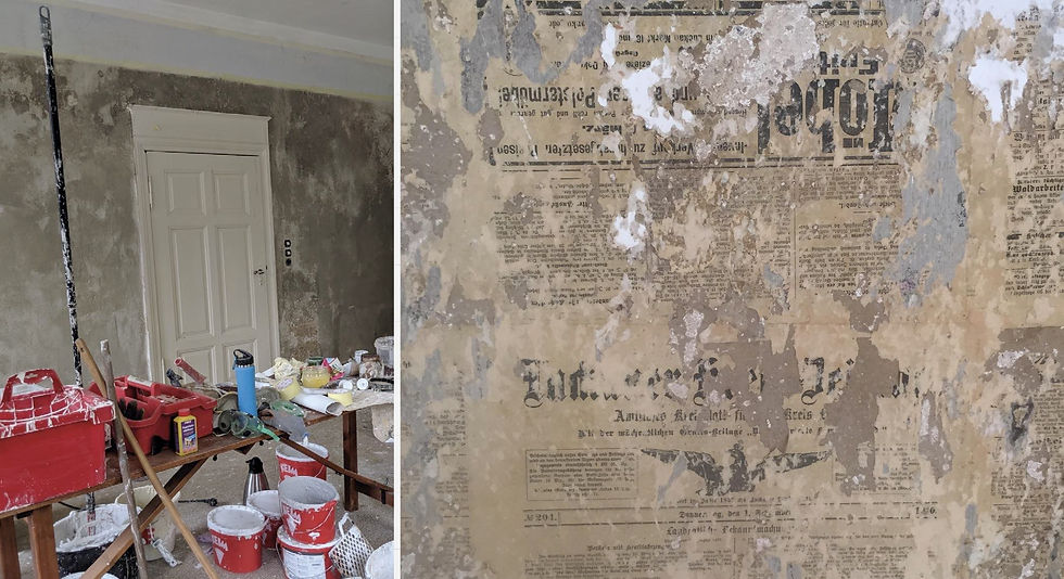
Example: Room with history and "substance"
The history of the community room of the rectory was hidden behind a textured wallpaper. The room was sterile and smelled of the plastic floor from the seventies. When removing the wallpaper, layers of newspapers from the same period, the twenties, and even from the turn of the century walls emerged. And the old light frieze, which corresponded with the door portals, became visible again.
The colors were mixed in the room to test color effects directly. Because we didn't use color charts with color numbers, later touch-ups, if necessary, are often visible.

Initially, we attempted to let some typographic features of the old newspaper prints shine through with semi-transparent overlays, but it ended up looking somewhat blotchy, especially when viewed from a distance.

The "wall patina" is created through color reactions with the different materiality of the substrate and through the pigment traces that unfold only during painting. The natural clay colors complement beautifully with the equally natural burnt clay and the old linen of the curtains.

On such a wall, light has entirely different possibilities for expression compared to a sterile white wall or one painted with bright synthetic colors. The wall is practically more "resonant," and its effect in the room is more "atmospheric."

Depending on the time of day and the season, the colors may appear cooler or warmer.
The colours we used in the house were lime paints for moisture-prone areas, clay paints for most living spaces, and purely mineral paints (silicate paints) for rooms where the past had already disappeared without a trace.
When faced with expressionless or completely disparate walls, I sometimes sought "painterly solutions," always mindful of the risk that the result might appear overly contrived and staged.
Most of the time, I experimented with incorporating "what was given." I incorporated wall textures and their specific materiality (similar to the grattage or frottage techniques used by Max Ernst) into the wall painting. Alternatively, I left some pigments in the painting material partially undissolved, resulting in random color variations during the painting process.
Example: Some rooms in the manor house.

There were walls that were so inconsistent and disparate that they were artistically covered with paint. In doing so, I aimed to create a liveliness in the wall color by working with a base coat and a subsequent layer of paint.

Dark red and gray-blue were often used colors in the house at the time of its creation. They still suit the house. The overlaying color was applied very dryly at one point. This allowed the dark red to shine through the porous wall structure, resembling pointillism.

The application of paint with a wetter consistency, on the other hand, resulted in spontaneous color blending with the underlying layer during the painting process. This was particularly evident in the green salon, where shades of fireplace red intermingled with warm gray-green tones.

The colored areas are bordered by light clay tones in a manner reminiscent of a mat. This creates an effect similar to that of a frame, where the main colour appears less dominant and lighter.

I also experimented with non-lightfast colors made from black tea and turmeric in the yellow salon. However, the initial opaque yellow coat appeared too sterile and unnatural. In this case, I "patinated" the walls with lightly tinted water, creating a slightly greenish or reddish hue in certain areas. Can you notice the difference?

In the overall effect, this hasn't been noticed by anyone yet. However, it somehow renders the atmospheric impact of the room more indefinite and ethereal.
This particular effect of changing walls is that we feel more comfortable in them because they are more naturalistic. Our natural environment is full of diversity and change. These artificially perfect walls have only been part of our living environment for about the last eighty years.
This effect is enhanced by choosing natural or organic pigments. I had to repaint walls because synthetic colours often appear more aggressive and disharmonious. Like in the green salon, which now shimmers in the gentle green tones of earth from Bohemia and Siena.
A fundamental realization, stemming from the use of natural colours or carriers, is that many things, as they were done back then, seem much more sensible and sustainable to me today. Lime and clay paints do not need to be disposed of. They weather much more organically and aesthetically, and they are easier to repaint since they do not peel off in patches like dispersion paints and synthetic varnishes.
Finally, another important reason why I'm writing about this here. It happens from time to time that we are asked if we want to repaint a room that we have restored in such a way that it is almost "subliminally perceptible". Today, many people expect this perfection, which we avoid for the reasons mentioned. So, if you're looking for a more "clean" environment, then this might not be the right place for you.

In some rooms, we initially reconstructed them in a "historicizing" manner. For example, a room in the basement, where it's already dark. There, we broke up the walls with "modern" white areas. The historicizing painting becomes a quotation in this context.


Comments